2022 Color Trends
Color trends. I have mixed feelings about them. “Trends” can make people feel forced to stay within the box of what’s popular at the time rather than what they like or love. However, today’s blog is all about color trends for the first half of 2022. I do believe looking at trending colors can maybe open up fresh options that lead to inspirational solutions.
Here are six colors to consider as you work through your 2022 home projects:
1. Dusty Brick: This color provides a great way to introduce a feminine feel into your space without going full-on pink. Paired with some darker, more masculine furniture or accessories, it can also be a terrific compromise color in the ever-present dance that many of us do with our special someone who we live with and love but don’t always agree with.
2. Deep Blue-Green: Certain to add drama to your space, this saturated blue-green is simply gorgeous! It puts a new spin on blue. It’s bold so you’ll want to make sure your space can accommodate it, or the space may end up feeling cave-like. If your room is large and has lots of light with high ceilings, it could be good deep blue-green candidate. If your room isn’t a good match but you still love the color, then you may want to consider a beautiful accent wall to add visual interest.
3. Dusty Gray-Green: Some version of this color has been trending for a while now. It’s a more subtle way to use green in your space, and the gray undertones make it a quasi-neutral that will go with many different accents. Dusty gray-green also provides an excellent way to bring the color of nature inside.
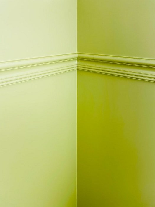
4. Chartreuse: Definitely not for the faint of heart! Chartreuse makes a big statement in whatever room it fills. I would advise against using it in a bedroom since loud colors make relaxation difficult. You will probably want to avoid use in a bathroom where makeup is applied. The yellow and green undertones can affect your skin tone and make getting the right look challenging.
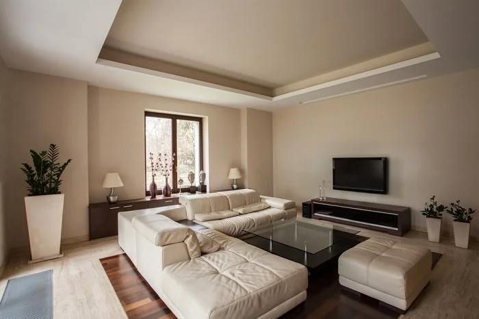
5. Taupe: Yes, neutrals are still on trend, and they probably always will be since they go with everything, This particular color has a calm and clean look that pairs with any other color that tickles your fancy. Some people find neutrals to be boring, however they can serve as a terrific backdrop to more daring color choices in accessories, window treatments, or accent pieces. Since neutrals never go out of style, they can have a long life that allow you to simply make a few small changes to give the space a whole new look and feel!
6. Medium to Light Gray: Yes, gray is still among top color choices. It varies from year to year in that sometimes it’s a darker shade and sometimes it’s almost a white. This year’s choice seems to be a mid-shade. Another fantastic neutral, gray can be paired with about any other color your heart may desire, as well as any wood finish. It carries a calm, clean look and feel that I love. If you love neutrals but you’re over taupe give gray a chance. You won’t be disappointed.
I hope this post gives you some fresh ideas. If you’re planning on painting a room or two, be sure to check online for the myriad of choices available. Again, don’t feel you have to live within the boundaries of trending colors. Follow your heart and gut. They are always your best gauge to get the look you want and will love.
Now, what will you do next to love where you live?
Please feel free to reach out to us at The Redesign Habit and ask questions or simply share a project that you are working on or have completed.
For more great stories and ideas please follow us on Facebook, Instagram, and Twitter.


