5 DESIGN CHALLENGES YOU CAN FIX WITH PAINT; A HOW-TO GUIDE
Choosing paint colors is one of my absolute favorite things to do, and thinking about choosing paint colors runs a close second, so writing this blog was a lot of fun.
You may know that painting with just the right color can completely transform a space and the way it makes you feel, but did you know that painting also can solve some of your home’s toughest interior design challenges? Read on and learn how to fix it…
Design Challenge 1 - Poor Flow:
In today’s world of open concept design, achieving good flow (the transition from one space to another) is more important and more challenging than ever. If you walk through your home and feel disconnected, like things aren’t quite right, you likely have a flow problem. Fresh paint provides several ways to fix flow:
To fix poor flow:
Choose complimentary colors or shades of the same color in adjoining rooms; you can experiment with paint card samples or small amounts of your paint to narrow down your search for a satisfying color palette
Apply the complimentary color/varying shades concept above on different walls of the same room; this works especially well to add variety to large rooms and distinguish separate sections—like a dining room-living room combo, or the music or theater portion of a family room
Pick up a color from a significant object in an adjoining room—this could be a large piece of furniture, work of art, area rug or anything that makes a color statement—and carry that color through via your paint choice
Design Challenge 2: Dark Places -
My former kitchen was in the corner of a large open area but had no windows to let in natural light. It always looked dark, even in the middle of the day.
To fix it the dark area:
I painted the cabinets a beautiful, classic white. Problem solved. The kitchen was instantly brighter because the white reflected the light from other areas.
Design Challenge 3: Overly bright rooms -
Want to make your master bedroom feel more like a relaxing retreat? Choose a soft color scheme and avoid white and bright colors.
Softer colors create a restful mood and are easier on your eyes so you’ll immediately feel more relaxed. You can prove this to yourself by noticing how you feel a greater sense of calm when you enter a space with a subdued color scheme.
Design Challenge 4: Small or tight spaces -
By choosing colors that are lighter and cooler (think lighter shades of blue or green) rather than bolder and warmer (think bolder reds, oranges, yellows) in a small space you are essentially tricking your brain. This happens because cooler or less intense receding colors appear to pull away from your eyes, giving the illusion that the walls are back further and the room is bigger.
Design Challenge 5: Big, cavernous-feeling rooms -
If you guessed the solution to #5 is opposite #4, you are correct.
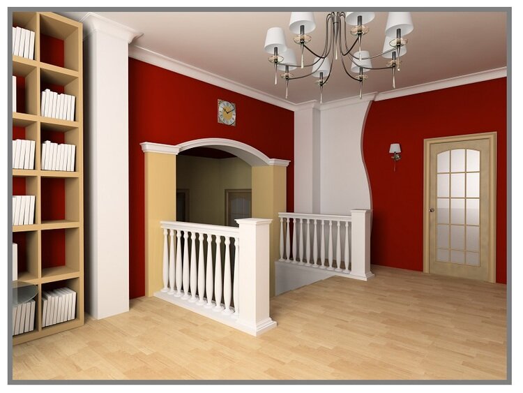
You can shrink the feel of larger rooms by going with a bolder, warmer color. These advancing colors seem to move toward your eyes, making the walls appear closer and your space smaller. Again, note the perceived size difference when you’re in a room painted with a cooler color compared to a warmer one.
I hope you learned some new tips to help make your home feel more like home. Most importantly, I hope you’re inspired to paint, repaint, and paint some more. Nothing else can do so much for your home for so little!
Now, what will you do next to love where you live?


