5 Interior Design Mistakes and How to Avoid Them!
If you ask your favorite search engine, app or robot for the definition of interior design, you’ll get something like…the art and science of creating a functional, safe, and aesthetically pleasing indoor space. Little art, little science. How hard can that be, right? The answer, if you ask most people, is “darn hard.” It can be tricky to make your interior look as good as those amazing Pinterest boards instead of an Ikea catalog that exploded everywhere!
Stay tuned as this blog walks you through common mistakes and how to prevent them. My goal is to help you avoid turning your home into a "what-were-they-thinking" zone.
Mistake #1. Too Matchey Matchey
What You Think: “I’ll buy the matching set! The sofa, loveseat, coffee table, and even the throw pillows all in the same style. Coordination is key, right?”
Reality: Now your living room looks like a furniture store display. It's as if you bought the entire showroom floor and plopped it into your house, complete with the same sad fake plant in the corner.
Why This Happens: It’s easy to think that matching everything creates a cohesive look, but in reality, it can create a bland, cookie-cutter effect. It’s like wearing a denim jacket with denim jeans and a denim hat. Sure, it’s consistent, but also… no.
Pro Tip: Mix it up! Add variety with different textures, patterns, and even furniture styles. A modern sofa paired with a vintage coffee table adds depth and personality. Think of it as hosting a party where your guests (aka your furniture) have different backgrounds but still vibe together.
Mistake #2. Rug the Size of a Postage Stamp
What You Think: “This small rug will really tie the room together and look at the price—bargain!”
Reality: Now your rug looks like it’s been awkwardly placed in the middle of the room as an afterthought. Maybe it’s a little island for your coffee table to live on, but the rest of your furniture is floating in no-man’s land.
Why This Happens: People often underestimate how large rugs need to be to ground a space. A too-small rug not only feels out of place, but it makes the room feel disconnected.
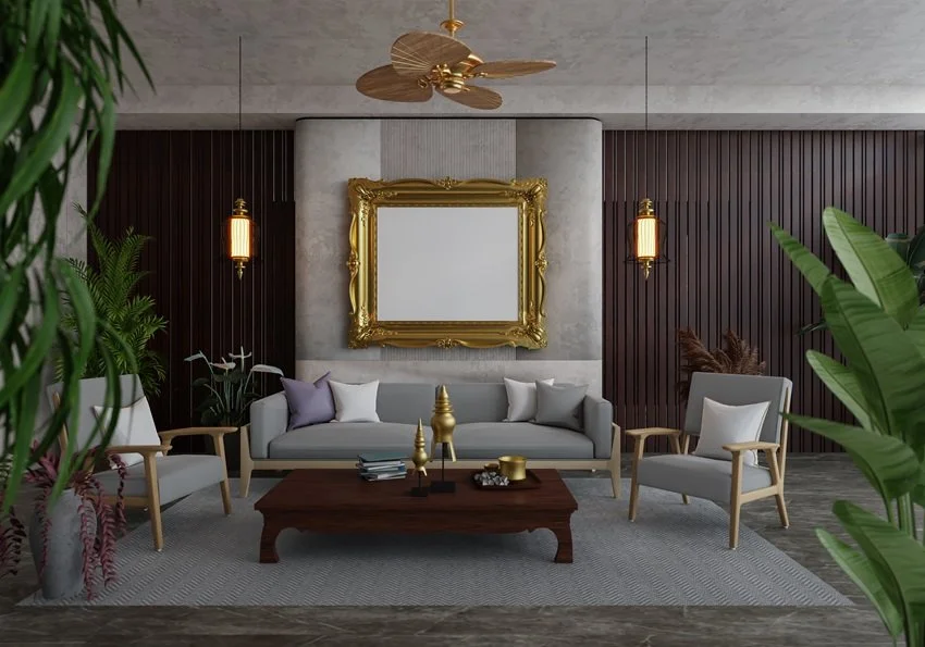
Pro Tip: Size up! Ideally, your rug should be large enough for at least the front legs of your furniture to sit on it. The right-sized rug makes everything feel cohesive and will help to ground your larger pieces of furniture in the room.
Mistake #3. Gallery Wall - Slash - Crime Scene
What You Think: “A gallery wall! How hard can it be? I’ll just throw up some random frames, and boom—instant sophistication.”
Reality: What you've created is not so much a gallery wall as it is a confusing puzzle of mismatched frames hung at wildly different heights. Your guests are squinting and tilting their heads, unsure if they're supposed to appreciate the art or call for help.
Why This Happens: The spontaneous “just eyeball it” method rarely works. Without a plan, it’s easy to end up with chaos on your walls, where no one piece gets to shine.
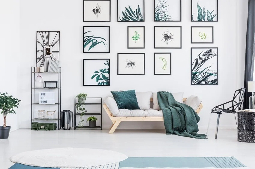
Pro Tip: Plan ahead. Lay your frames out on the floor or a table before committing to the wall. Use painters tape to map out the arrangement and make sure everything is at a cohesive height. And don’t be afraid of negative space—your walls need room to breathe, too!
Mistake #4. Lighting? What Lighting?
What You Think: “This one floor lamp is fine. Who needs fancy table lamps or ceiling fixtures?”
Reality: Now your room looks like a doctor’s office: sterile, bright, and a little intimidating. Shadows lurk in every corner, and your home has all the ambiance of a DMV waiting area.
Why This Happens: Relying on a single overhead light leaves your space feeling flat and, well, lifeless. Layered lighting is the secret sauce that makes a room feel warm and inviting.
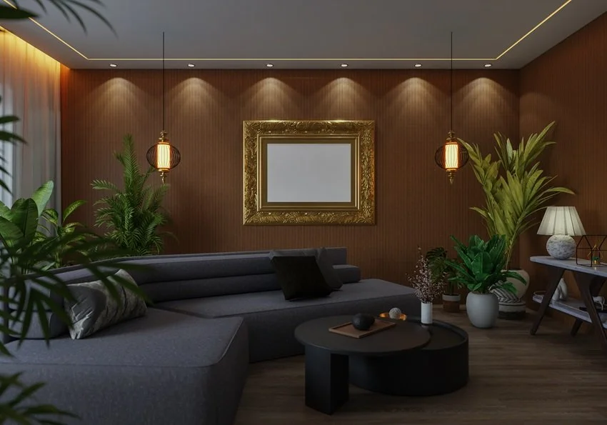
Pro Tip: Think in layers—overhead lighting, task lighting (like reading lamps), and accent lighting (such as floor lamps or wall sconces). The goal is to create a glow, not a spotlight interrogation.
Mistake #5. Too Many Pillows
What You Think: “More pillows equals more comfort. I’ll buy all the pillows!”
Reality: Now your sofa is buried under a mountain of throw pillows, and sitting down requires some serious excavation. Your bed? It’s a minefield of decorative cushions that you spend 15 minutes removing every night.
Why This Happens: Pillows are fun and easy to buy, but at some point, they start to take over, turning functional furniture into decorative displays that no one is allowed to use.
Pro Tip: Less is more. Stick to 2-3 pillows on a sofa or chair, and make sure they complement the space rather than suffocating it. When in doubt, ask yourself: “Could I actually sit here without being buried alive?”
Final Thoughts
Designing your space doesn’t have to be a stressful exercise in perfection. Avoid these common pitfalls and your home will thank you. And if you find yourself standing in front of a too-small rug or wondering why you can’t sit on your sofa because of pillow overload, just laugh it off. After all, every design disaster is just one paint job, rug swap, or pillow toss away from being a design victory!
Now, what will you do next to love where you live?
Please feel free to reach out to us at The Redesign Habit and ask questions or simply share a project that you are working on or have completed.
For more great stories and ideas please follow us on Facebook and Instagram.


