HOW TO ACHIEVE A COHESIVE COLOR SCHEME IN YOUR HOME
With today’s open-concept living, creating a cohesive feel is more important than ever. You walk in. You take in the space. When what you see is a flow throughout, you feel harmony, peace, and balance. This helps you feel relaxed in your home. And this is highly achievable with a little knowledge and effort.
Sometimes a space can feel uneven. You might not know exactly what, but something isn’t quite right. It may be as simple as a heavy concentration of color in one area, so visual balance is lacking in an adjoining space. Is that a big deal? It all depends on your personality and the look and feel you desire. To me, it’s a HUGE deal. I’m a very, very, very symmetrical person. Even with my words! One “very” seemed weak, two seemed out of whack, but a “very” sandwich seemed juuuuust right! But I digress.
Achieving a balanced look and feel can be accomplished through color placement in your space. Not just paint color on the walls, although that certainly plays into it, but also colors found in your artwork, lighting, accessories, and even furniture.
Our home’s floor plan is fairly open. When you walk in the front door, you can see living room, dining room, family room, and part of the kitchen. The kitchen is open to the family room and the whole living room is open to the upstairs hallway and loft.
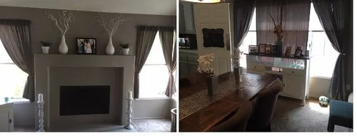
Living room and dining room are directly across from each other. Taupe on main walls and white on either end to help balance the two spaces visually.
To start my balanced look, I painted all of the walls on the main floor and upstairs hallway in the same taupe color. That was my foundation.
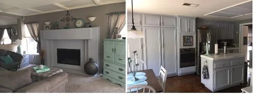
The gray on the fireplace helps bring the gray from the cabinets over into the family room. The green accent piece helps carry that accent color over into this space as well.
Next up, the kitchen cabinets. There are a lot of them and I chose a very light gray. To bring some of that color into the family room and help the two spaces feel connected, I painted the fireplace (directly across from all those kitchen cabinets) that same light gray.
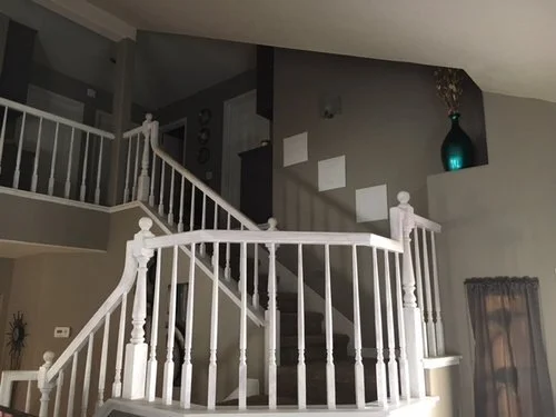
Looking from the living room to the upstairs. The white not only ties the spaces together and adds contrast to the taupe, it helps draw your eyes up.
Next I added white to all the window trim, interior doors, stairway bannister, and upstairs railing. This added another dimension to an already solid foundation as well as helping to visually balance the color palette.
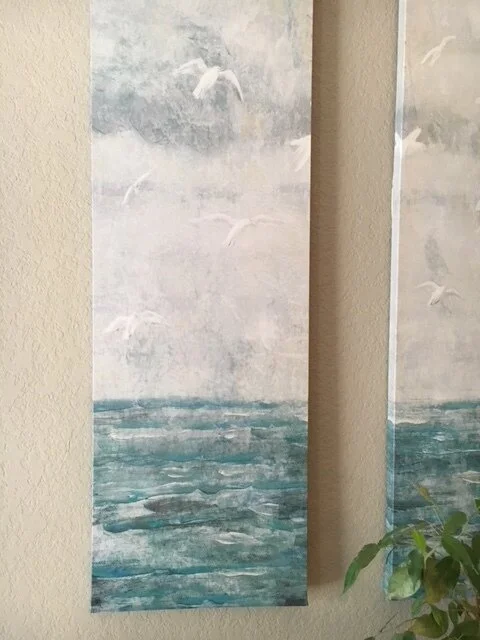
This set of artwork was my jumping off point for my accent colors.
To add interest and help break up all the neutrals colors, I turned to accent colors. I chose blues, greens, as well as some metallic accents. I found a set of artwork and hung it on the big open wall in the dining room, central to all the other spaces on the main floor. I could pull varying shades of greens and blues from the artwork as a basis for complementary accents throughout the space. As you can see from the photo, it also pulled in the wall color and the white of the trim. Remember, when you’re adding accent colors, a little goes a long way.
You can also achieve harmony by painting walls in adjoining rooms with different tones or shades of the same color. You can even use different colors that share the same tones and you will get more visual interest within your foundation. This can be a great way to delineate different areas within a completely open floor plan.
I hope these ideas help remove some of the mystery of achieving “flow.” Achieving cohesion and balance in your home can be a beautiful thing. I’m confident you’ll agree when you drag home at the end of a busy day, open your door, take a deep breath and say ahhhhh!
Now, what will you do next to love where you live?


