7 Basic Elements of Interior Design
My promise to you: read this blog and by the end you’ll be a little closer to operating as a professional decorator or designer. I’ll be covering the seven basic design elements pros consider each time they create an interior design or redesign plan. Knowledge is power, so read on and you’ll be in better position to wield your newfound power on your next home project.
1. Space
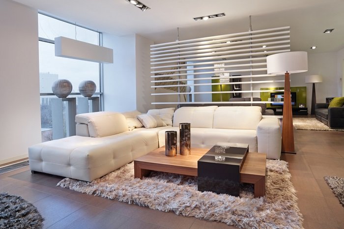
This element refers to both the positive and negative space within a room. The positive being the actual items in a room such as furniture, and the negative space refers to the area around those items. Ideally, you want to create a balance between your positive and negative spaces. Imagine a room with too many things in it. Probably feels cramped, off-balance, and claustrophobic. Now imagine a room that’s too sparse. Probably feels awkward, empty, perhaps lonely, and uninviting. Creating a balance between your positive and negative spaces helps create harmony and balance within your room. Remember that space refers to ALL items within your room, including accessories, window treatments, etc.
2. Light
A well-done interior space typically uses a balance of natural and artificial light. While it can be challenging to bring natural light into certain rooms, remember that natural light can be controlled with effective window treatments. The right treatment can diffuse very bright light and enhance low natural light. You also use mirrors and lighter color choices to help reflect natural light around the room. When you plan your artificial lighting, think of it as an exercise in balancing the natural light. Also, make sure you’re lighting has purpose. You can fill various size spaces with proper ambient lighting and when natural light fades, bring in task lighting to support any activities that take place in the room.
3. Color
My favorite element! Color gives your rooms personality. Color can make a room feel larger or more intimate than it really is. The magic of color affects the way you feel, from calm and relaxed to energized and focused. As is true with anything related to design, form should follow function. In other words, decide how you will use your room, and select colors that will support those activities.
4. Form
This one applies not only to the room itself but also the shape of furniture and items such as artwork and accessories within it. Geometric forms with straight lines will have a more masculine or structured feel while more natural or curved shapes can help soften a space and will have a more feminine feel to them. To get in touch with this element, try noticing the forms you encounter in different spaces over the course of a week: rooms in your home; business environments, shops, and outdoor spaces. Sharpen your sense of form and you’ll begin to know when forms support or don’t support the space well.
5. Line
Similar to form, lines relate to both the room itself and the furnishings and accessories within the room. Abundant horizontal lines tend to make a space feel wider. Vertical elements like windows, doorways, or a tall fireplace naturally draw your eyes upward. This can make a smaller room feel more spacious because you are visually taking in all of the vertical space up to the ceiling line in addition to the space that is down at your level. You can also use vertical artwork, tall plants, and other accessories to help achieve this.
6. Pattern
Found on fabric, wallpaper, artwork, and many other items that can make up a room’s interior. Pattern is an often-overlooked element that can add interest to a room. Think of using a patterned wallpaper as an accent wall in a room. When you enter, your eyes will automatically be drawn to that pattern. Pattern can help make a room feel more masculine or feminine, depending on the shapes within the pattern. Pattern can also help create flow from one space to the next in a more open floor plan. Use caution with pattern though because it can also make a room feel hectic or too busy if you have too many patterns in one space or a very small pattern that dominates a room.
7. Texture
Think of texture as feel, how things feel when you touch them. Texture provides another terrific option to add visual interest. If you don’t want a lot of pattern in a room, texture can save the day. While you may want a room to have quite a bit of similar textures to create a consistent effect, mixing textures can help add depth to your finished space. The main thing is to be aware of texture, experiment, and see how various options impact how much you enjoy your space.
Now you have the inside scoop on elements that are second nature to the home pros. Consider these elements in your next project and see how they can impact your results. Keep up the habit and pretty soon, the seven design elements will become second nature to you.
Now, what will you do next to love where you live?
Please feel free to reach out to us at The Redesign Habit and ask questions or simply share a project that you are working on or have completed.
For more great stories and ideas please follow us on Facebook, Instagram, and Twitter.
Never miss a new design tip! Subscribe to receive a weekly email of the latest blog posts.


