DANCE STUDIO MAKEOVER - THE FINALE
It’s rare that you pursue a design project—large or small—JUST because you’re bored and want a change. Usually, you’re bored with your space AND you’re redesigning to meet a functional need—you need more room to exercise, or to fit that extra-mega flat screen TV, or to display your gnome collection (please don’t have a gnome collection). When dance studio owners Lisa and Katie first approached me for help with their studio, they were experiencing major pain points. We worked together to uncover solutions and to discover a vision for how their studio could look. This is the same process you should undertake with any of your projects.
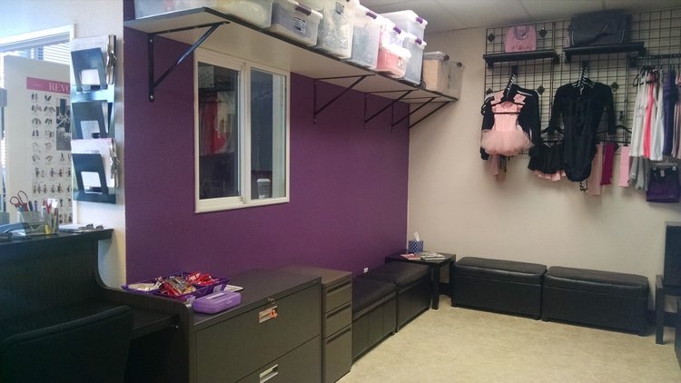
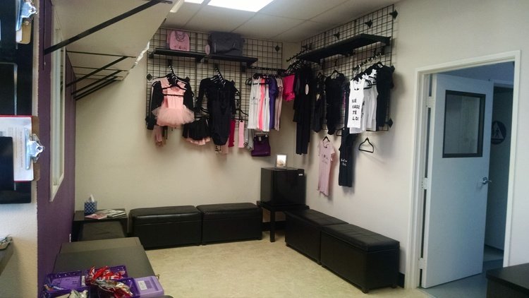
According to Lisa, the most beneficial impact has been the creation of a private office where she and Katie can manage their business without a lot of traffic, including students passing through to use the restroom or sit in the lounge. Creating a place to display merchandise in the lobby, and to lock up excess merchandise and loaner shoes was another big benefit. With this set up, the receptionist instead of the owners can assist clients with purchase and clothing needs.
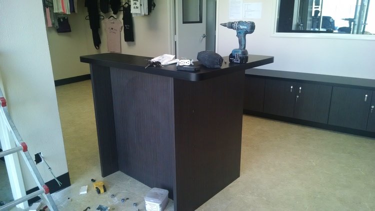
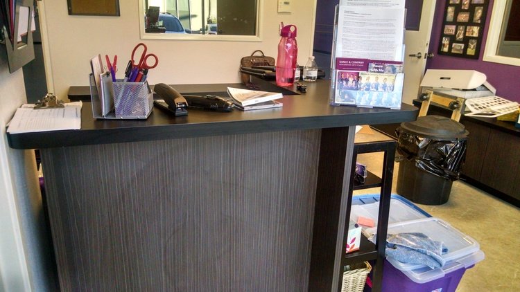
Positioning the reception desk by the front entry has really changed the dynamic of the studio. It establishes a more friendly, helpful atmosphere and signals to everyone that the receptionist is the person to see for assistance. It also creates a more intuitive and orderly traffic flow between classes. And the new one-way viewing glass provides an excellent way for parents to watch their kids without disrupting the kids’ concentration.
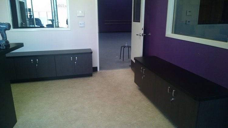
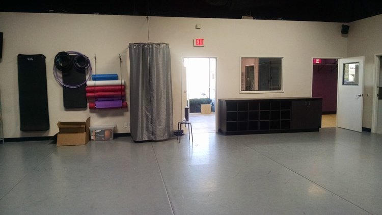
Overall, the studio makeover was a big success. The initial reaction by Lisa and Katie and their clients was “Wow!” Many parents and students have commented on how much more user friendly the space is, and how clean and organized it looks.
Here are some additional photos to prove it:
I’ll close by sharing some wisdom Lisa gained by undertaking this project: “Don’t let a modest budget stop you from pursuing your dreams. Your business design project budget may stretch more than you think, and bigger isn’t necessarily better. In our case, we were able to use the space we have in a much more efficient manner and with minimal cost. Never be afraid of exploring change, especially if you have friends around to lend a hand!”
You may not have friends who want to redesign their dance studio, but if you think hard, I’ll bet you have some places other than your home that could use some TLC and present unique design challenges. Your work office or cube? Your garage, shed or workshop? The space your kids use for their favorite clubs or sports? The same principles I shared in this blog series can be applied anywhere.
Now what will you do next to love where you live?
